Reduce the burden on users and help them regain control over their healthcare journey, fostering a more user-centric and stress-free experience.
Responsive Web App / UX Research / UX/UI Design / Interactive Design / Usability Test
Project
UX/UI
Solo Student project
Duration 5 months
2023 - 2024
About
The goal of the project was to design a one-stop healthcare platform that covers all aspects of medical care, with the help of innovative technology.

People fail to identify
possible health issues
Problem
Wellness has been a significant trend for quite some time now. People are seeking tools to help them stay on top of their health and wellness, as well as achieve greater balance between the challenges of health, wellness, work, and life in general. Yet, many people fail to identify possible health issues early on and seek help in a timely manner.
Despite the abundance of knowledge, various types of apps, and other tools available to prevent mental health issues and burnout, why are burnout and mental health issues on the rise? How is it that so many still fail to seek help early on?
Why is there such a significant gap between the knowledge we have and the actions actually taken?
Turn Insights to Action,
with Predictive Healthcare
My Solution
With emotional AI and wearable devises, customers can predict various health problems, including mental health problems and burnout prevention. The platform calculates personalized risk scores for diseases based on user’s health behaviours and medical history, providing personalized advises based on the results.

White Paper Research
Burnout rate is up year after year
Web is full of articles about burnout sympthomps and recovery. There are efficient methods for dealing, treating and coping burnouts, and every article highlighted that it is important to get help in the early stage, so, that the burnout doesn't progress to a difficult stage.
Still, recent studies show that burnout rate is up 13.5% from 2021 into 2022. *

Competitive Analysis
The competitors offered help mainly for recovering
I delved into multiple healthcare platforms, each with its unique offerings and strategies. While some provided comprehensive medical data access akin to the platform in question, others offered specialized services or focused solely on data collection. Despite the absence of directly comparable competitors, this analysis provided valuable insights into the broader healthcare app market and shed light on potential areas for improvement and innovation within the platform. It became increasingly clear that while the platform may not have direct competitors, it operates within a dynamic and competitive landscape.
Understanding the strengths and weaknesses of healthcare and fitness apps, as well as emerging trends in healthcare technology, will be essential in guiding the platform's future development and ensuring its continued relevance and effectiveness in meeting user needs.

User Research
“I was 100% sure no one would
believe me”
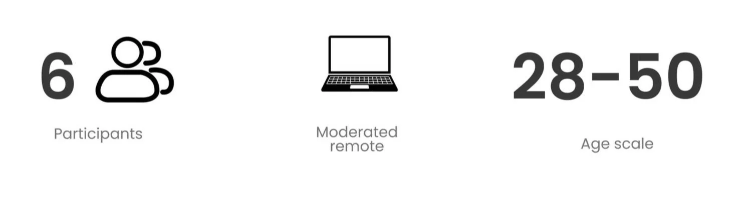
I employed a combination of methods: focus group and user interviews were great ways to start exploring my target group's feelings, needs, and experiences. Lastly, to validate the findings, I conducted a survey to gain insights into a larger group. My goal was to uncover similarities in working habits, triggers, personalities, and recovery, leading to a more comprehensive understanding of the topic.
User Research Goals
To better understand habits, feelings and experiences with burnout and depression
To get insights how participants are currently managing their health data and medical records
To determine what kind of support system and features users need
To understand users feelings towards predictive healthcare
Key Insights
Perfectionism and Self-Blame
Participants described themselves as perfectionists passionate about their jobs.
Self-blame led to longer work hours and ignoring symptoms.
Pressure to maintain high work quality contributed to feelings of inadequacy.
Symptom Ignorance and Fear of StigmaAll participants ignored symptoms and felt guilty for seeking help.
Fear of not being believed by doctors or managers prevented seeking help.
Participants struggled to recognize the right time to seek medical assistance.
Importance of Support and Simplified SolutionsSupport systems, including friends and family, were crucial in encouraging seeking help.
Participants wished for simpler solutions in accessing medical care during burnout phases.
Seeking help was considered a life-saving action, providing relief and empathy from doctors.
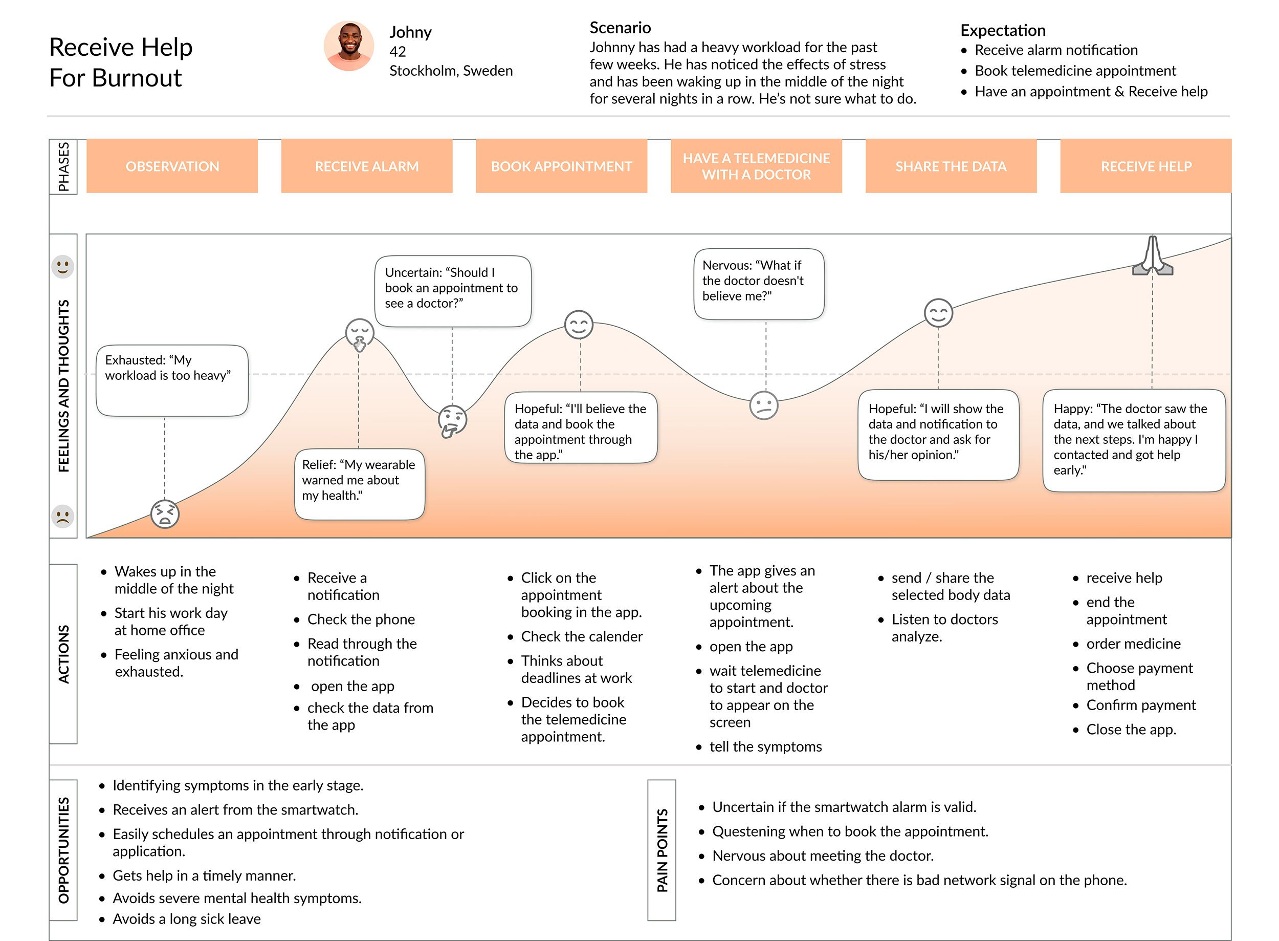
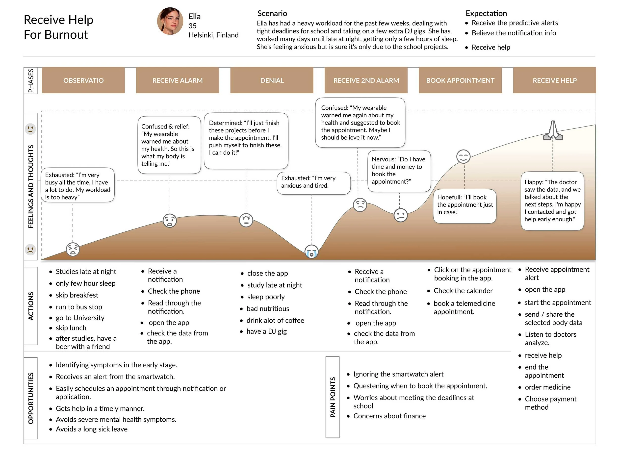
User Personas & Journeys
Empathise - How to help users to seek help?
With these insights in mind, I built personas to capture the motivations, needs, and pain points. Then, I created journey maps to pinpoint opportunities for my app to address these needs along the way. I focused on one journey especially; to receive help for burnout.
Meet Johny, Ella and Sara:


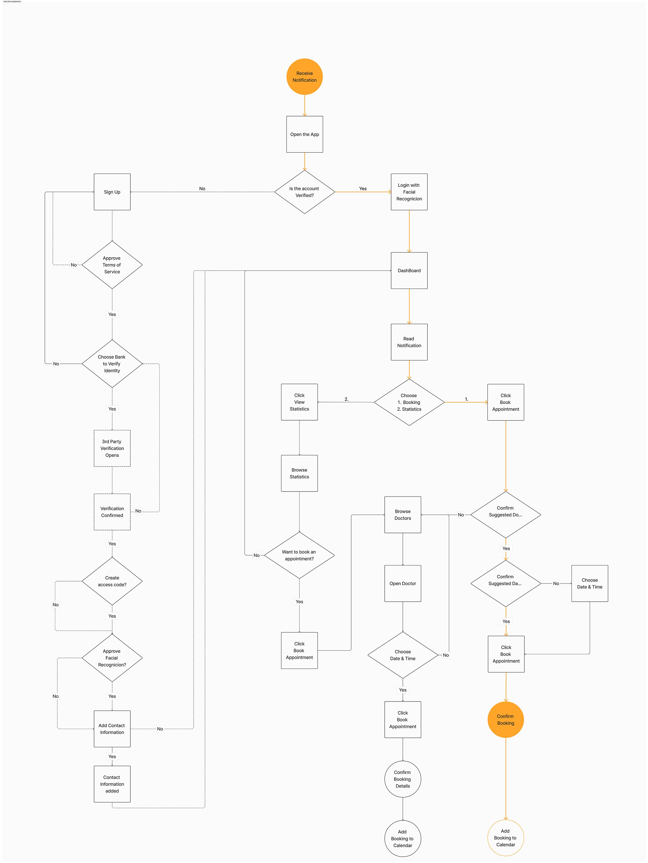
User Flows
To began, I mapped out the essential user flows, tailoring distinct paths for Johny, Sara, and Ella. These personalized journeys optimize user experiences, ensuring the app accommodates diverse needs and enhances usability. Crafting individual pathways reflects a commitment to inclusivity and a user-centric solution, addressing the unique requirements of users like Johny, Sara, and Ella.
Information Architecture
& Card Sorting
The structure of a preliminary sitemap for the project was refined by a closed card sorting session with five participants, using Optimal Workshop. To keep the number of cards reasonable, I excluded some parts of the site map.
To analyse the results, I did a similarity matrix and standardisation grids, which informed the revised sitemap. The importance of robust user flows between "Appointment Booking" and "Health Records" became evident, emphasising the need for easy access during appointment scheduling.

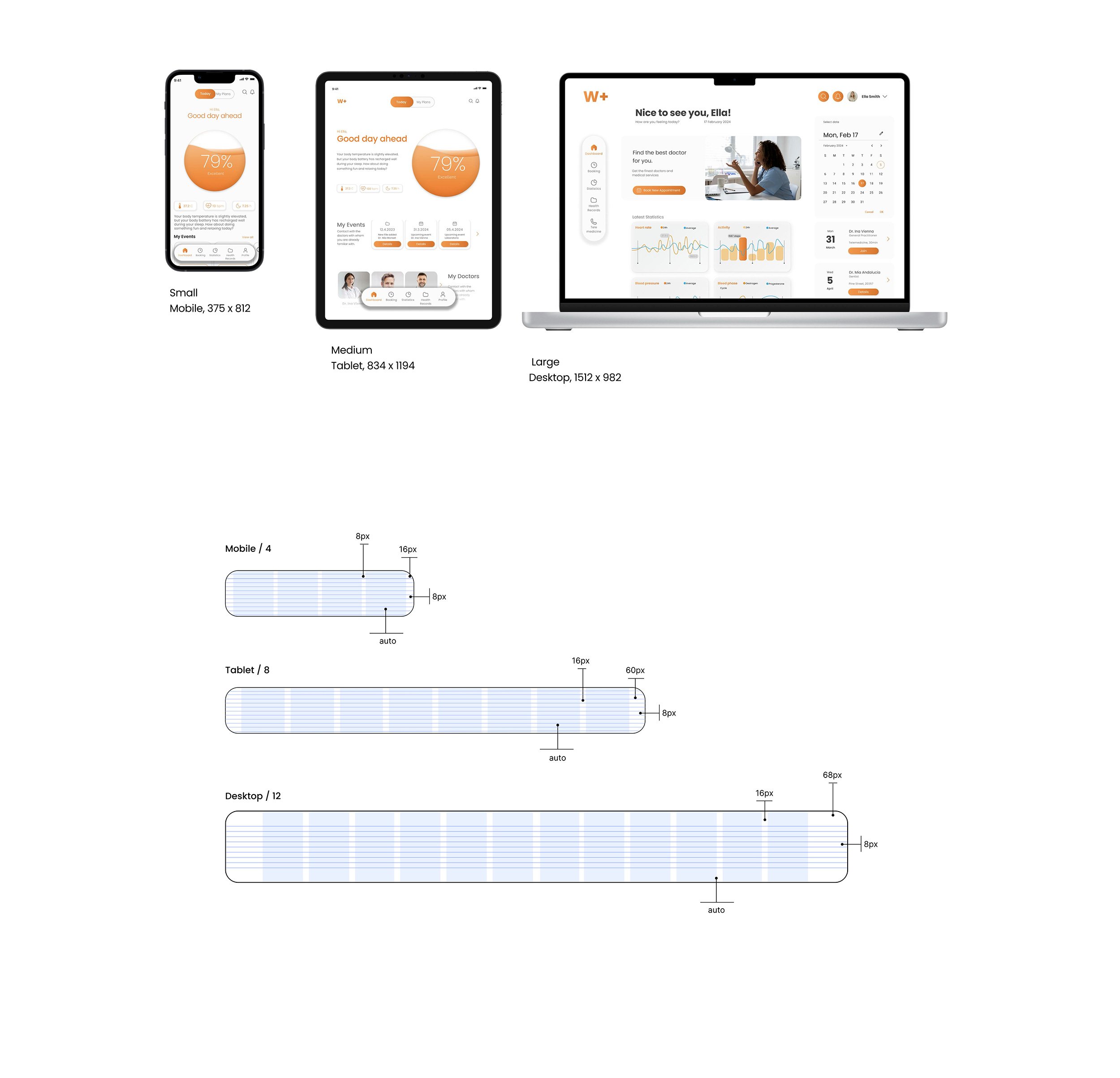
Mobile First Design Plan
I created a mobile-first design plan for the responsive web app, placing emphasis on optimal usability for mobile devices. The plan extends adaptability to various devices, including mobile phones, tablets, and desktops, with a specific inclusion of smartwatches / wearables. Prioritizing the mobile experience aligns with our medical care app's diverse user base. Despite the focus on mobile, the plan acknowledges individual preferences, allowing desktop usage for quite many tasks, such as reading documents, data and analyses and also conducting telemedicine, catering to the varied needs of our broad audience.

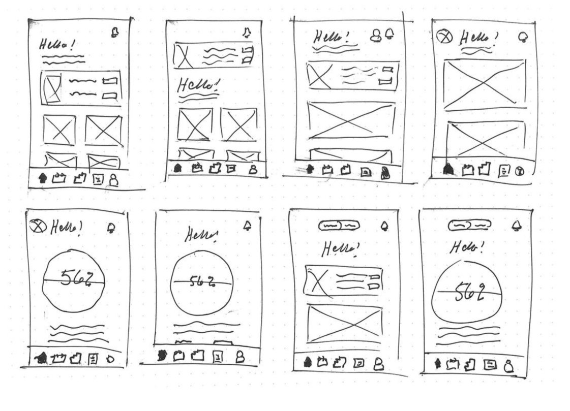
Design
I started sketching key screens to visualise initial layout and structure of the app. Sketches helped me to quickly ideate, iterate and test ideas, before moving to mid- and high-fidelity wireframes. This iterative approach has allowed me to refine my design solutions, address usability issues, and ultimately create a more user-centered experience.
Problem statement 1.
How might we help users to interpret their health data & seek help early on?
Problem statement 2.
How might we ensure user privacy and control over document access?
Sketching
The main goal of this app is to provide a clear overview of health, prevent illnesses and offer healthcare services in an intuitive, easy, and effective way.
First I focused on the Dashboard, which should provide users with a quick overview of critical information about their overall health, and also information about upcoming appointments and recent appointments.
Mid-Fidelity Wireframes
Transitioning to low-fidelity wireframes allowed for clearer visualization and structure, refining initial ideas. Progressing to mid- and high-fidelity wireframes added complexity and detail, providing a more accurate representation of the final product.

Usability Testing
The primary goal of the usability testing was to assess the effectiveness and usability of the Wholesome+ app in fulfilling its mission of empowering users to monitor their health, prevent illnesses, and seek timely medical assistance.
Key Improvements
Task 1. : Sign up
Error rating: 4 - High Severity
The onboarding screens and Sign up- process were indentified as confusing during the test.
Suggested Change:
Clear CAT -button for Sign up -process placed on the first screen. Users can swipe through onboarding screens, and click to sign up from all screens.
Before:

After:

Preference Test
The Dashboard should provide users with a quick overview of critical information about their overall health, and also information about upcoming appointments and recent appointments.
I bounced back and forth with two type of ideas; a lot of data with one glance, or; one health indicator for users overall health state?
I used Lyssna to conduct a preference test to gather people’s opinions about it. And there was no question about the winner.


UI Design
Authenticity is central to the approach; to connect with users on a human level, reflecting the app's personality and values. The brand encourages user feedback and engagement, welcoming input and actively listening to user concerns with empathy and understanding.

Final solution
Feature 1.
Get a clear overview of health

Dashboard visualize your overall health index based all the data, to get a better scope
Illness detection will guide you to make better healthier choices and to predict future
Learn how events in your life are tied to changing levels of anxiety, stress and depression
Justification
Participants expressed difficulty in understanding their overall health (focus group and user interviews). A dashboard health index would enable users to better grasp how individual data points affect one another.
Some participants mentioned they don’t want to track individual data statistics daily but would prefer a better understanding of their overall health state (interview).
Feature 2.
Get notified if alarming changes are detected

1st Notification

2nd Notification
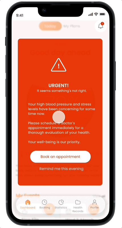
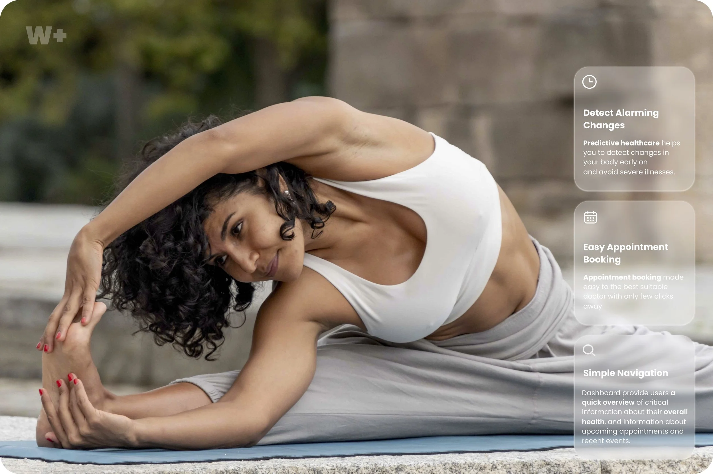
Predictive healthcare helps you to detect changes
in your body early onSimplified solutions in accessing medical care during burnout phases
Appointment booking made easy to the best suitable doctor with only few clicks away
Get guidance and help for more balanced & healthier life and avoid severe illnesses
3rd Notification
Justification
100% of participants reported difficulty in knowing when it’s the right time to seek help (focus groups and user interviews), often leading to delayed appointment bookings and more severe burnout and depression.
Participants also expressed feeling overwhelmed when booking doctor appointments during the burnout stage (focus groups and user interviews). A notification system that directs users to the most suitable doctor with just a few clicks could help reduce the emotional burden of seeking help.
Feature 3.
Transparent solutions for your privacy

Control Reading Permissions
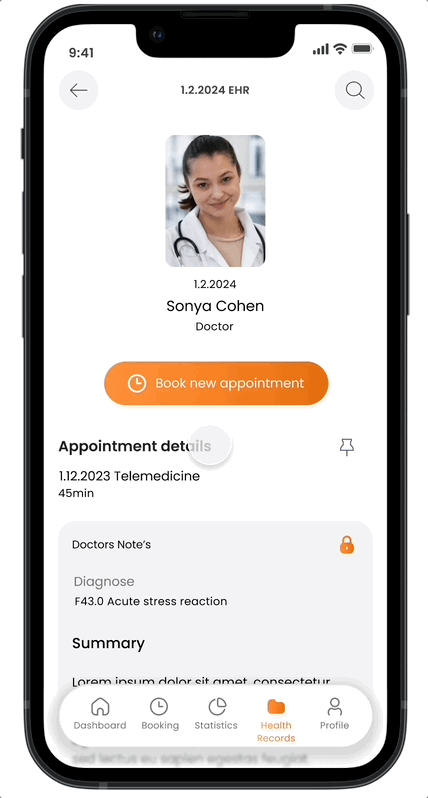
An AI-enabled 'Look-up' feature
Store all you healthcare documents in one place
Monitor your privacy and control reading permissions
Get notified when your documents have been opened and viewed
Look up -feature helps you to easily understand all medical words and the meaning of codes
Justification
Participants expressed significant concerns about their privacy (focus groups, user interviews, and surveys). Providing an option to monitor privacy settings and control reading permissions would help users feel more secure about their sensitive information.
Some participants reported difficulties interpreting medical terminology and codes (interviews), leading to uncertainty or extra time spent searching online. An AI-enabled 'Look-up' feature could significantly reduce the time spent and help users feel more in control of their health.

Conclusion & Reflections
In conclusion, this project has been an invaluable learning experience, providing insights into the intricacies of user experience design and the importance of prioritizing user needs. Through this project, I have learned:
Prioritization: It's just as important to understand what to leave out as it is to know what to prioritize, especially when time is limited. My first version, or minimum viable product, may not have all the desired features, but I can continue to refine it and plan for improvements in the future.
Design systems: Establishing a design system is essential. I started working in Figma without a structured design system, and as I added more screens, inconsistencies quickly emerged. I realized how crucial it is to set up a design system from the start.
What I’d do differently
I’d conduct preference testings more often to validate the screens more efficiently
I’d arrange a usability testing with low-fidelity wireframes to detect severe usability errors early on.
Overall, this project has deepened my understanding of UX design principles and methodologies, equipping me with valuable skills and insights for future projects in the field.
Next Steps
Next steps will be to
- Design all notification flows
- Design UX/UI for the smartwatch
- Add voice experiences
- Arrange new usability testing round
Check out similar works

Unmute Your Language Skills

Revolutionize cooking by voice commands